


Pearl Forest: Brand Story Concept
Brand story concept for this trademark.
1. The Inspiration Behind the Name
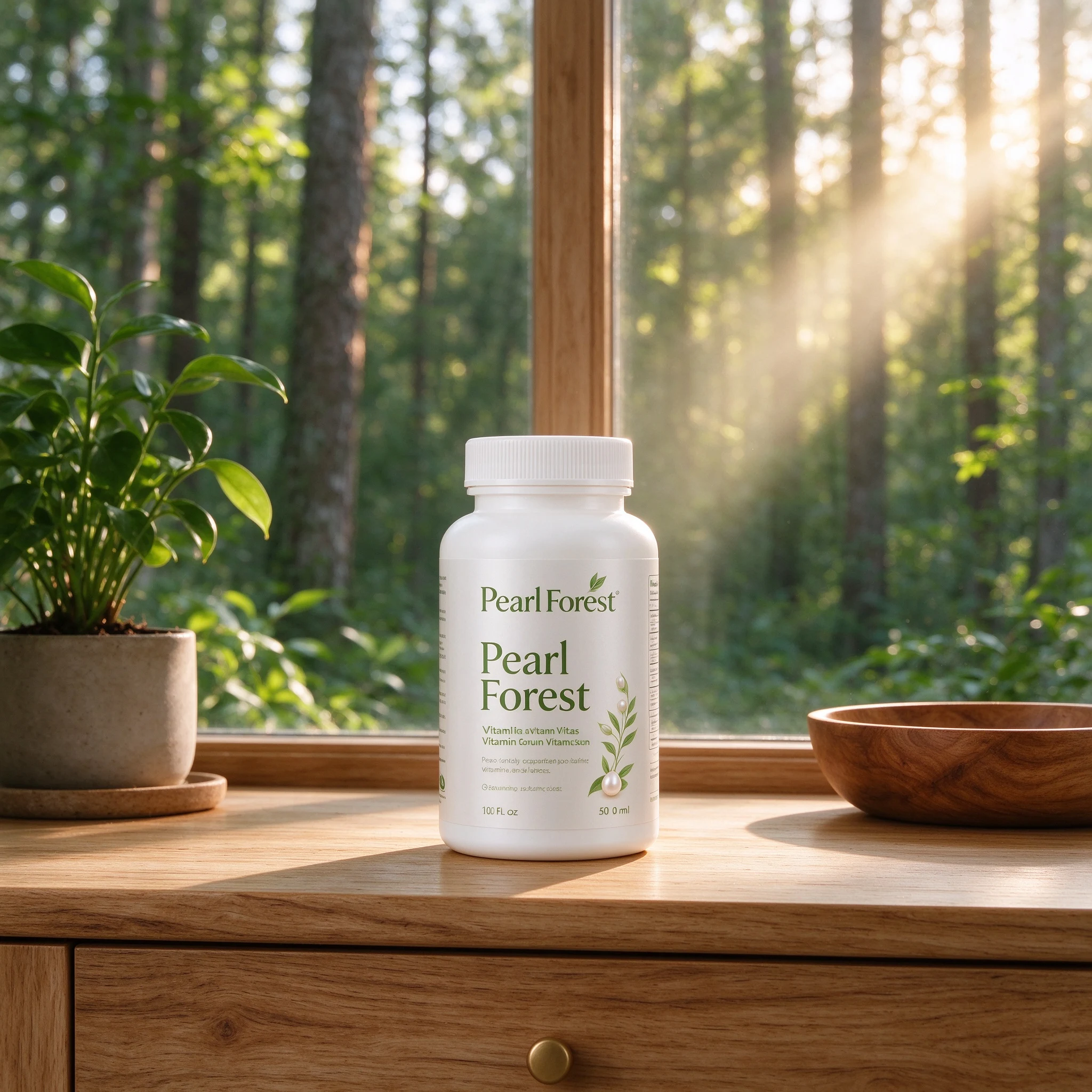
Pearl Forest brings together the quiet lustre of a pearl and the vitality of a forest. Morning light on dew, wooden surfaces and fresh greenery inspire a calm nutritional-supplement identity. Nature is the creative reference for a range of vitamins, protein powder and fish oil, rather than an unverified claim about ingredient origin.
2. Brand Inspiration
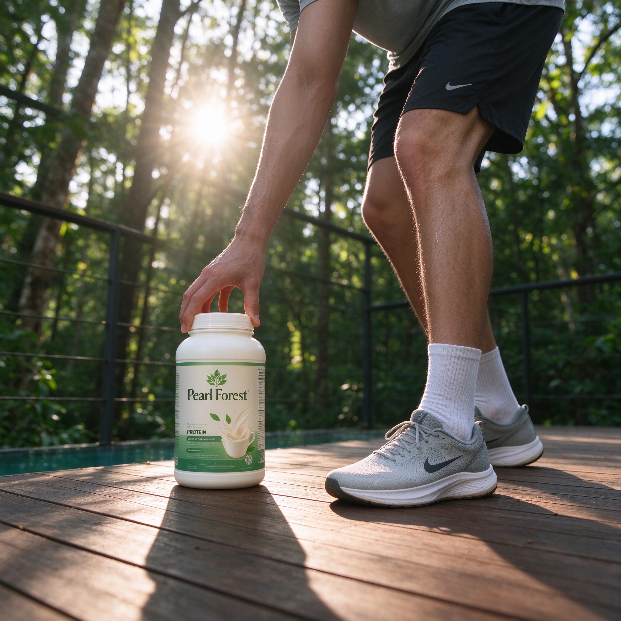
The imagined founding studio responds to overly elaborate packaging and confusing product information. Its proposed approach is clear ingredients, familiar formats and an everyday place in the home: vitamin tablets, convenient protein powder and fish-oil capsules.
3. Product Philosophy
Quiet, lasting care is the central design idea. Forest green, pearl white and restrained packaging suit a dressing table, bedside tray or bright kitchen. Clear directions help the products fit an established routine without making nutrition feel like a complicated assignment.
4. Quality Commitment
The proposed standards focus on ingredient selection, accurately formulated products, hygienic filling, legible labels and secure seals. Taste and aroma are also considered. These development priorities express thoughtful care without asserting proven health effects or completed quality certifications.
5. Market Vision
Pearl Forest is envisioned for working adults, outdoor enthusiasts and families seeking approachable everyday nutrition. Its range could expand into more daily occasions while maintaining a fresh, calm and dependable identity.
6. The Brand in a Nutshell
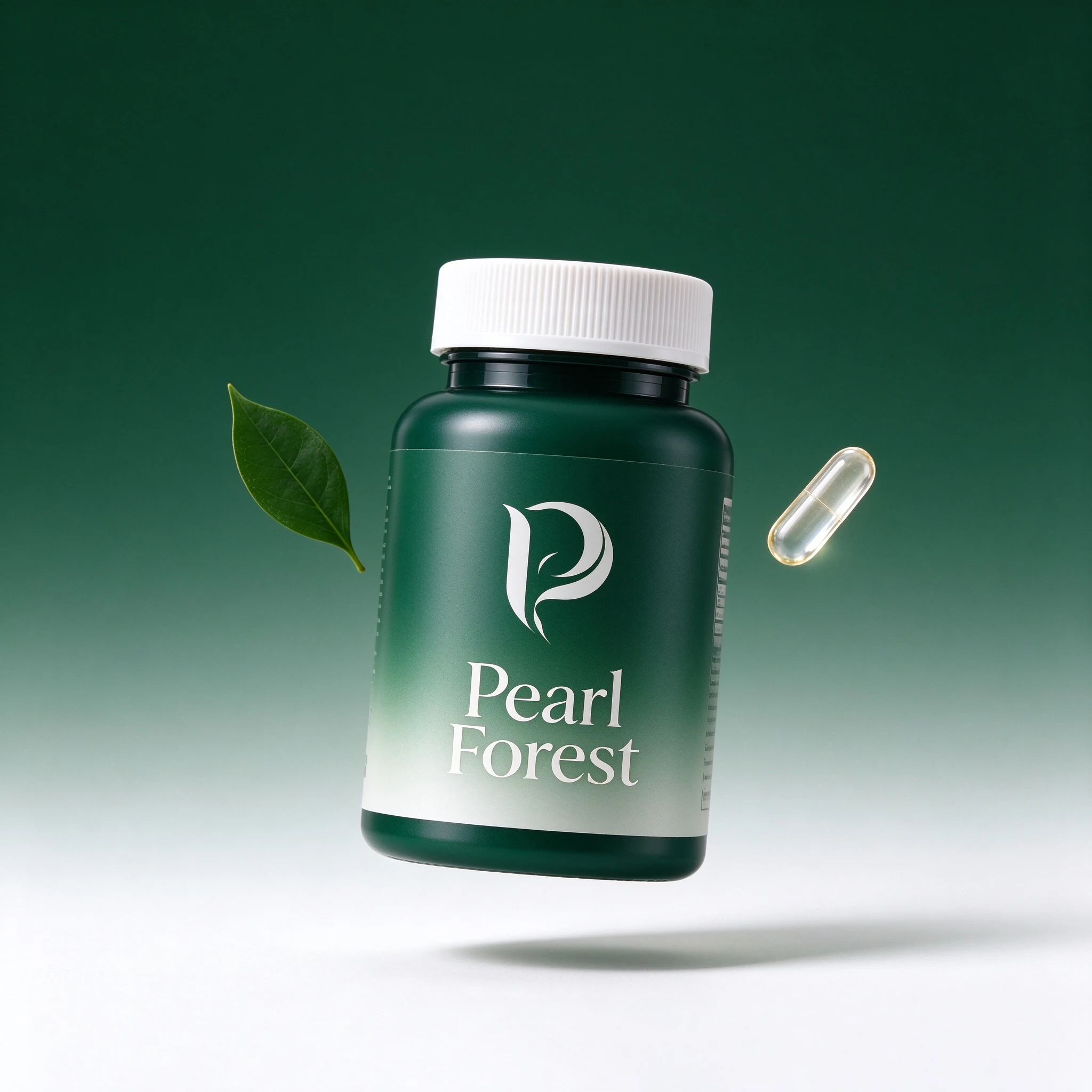
Pearl Forest combines the softness of pearl with the freshness of woodland. The brand concept turns that imagery into simple supplement packaging and a gentle invitation to make room for daily self-care.